Rosetta Stone Mobile Demo
Rosetta Stone's web traffic has been increasingly shifting towards mobile devices; unfortunately, their demo experience uses Flash technology extensively-- something not available for most mobile users. It was time to build an HTML 5 demo from the ground up; not only to reach mobile users, but also to optimize how to communicate Rosetta Stone's proven methodology more effectively.
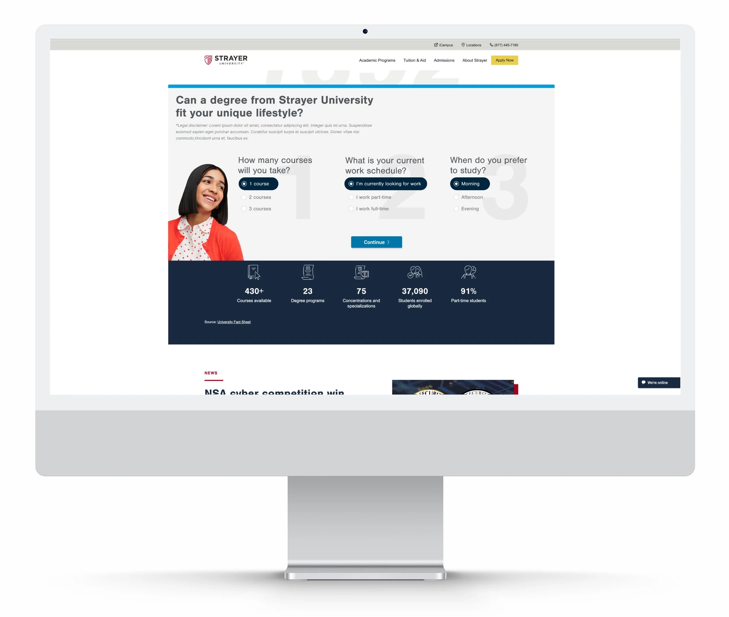
Sophia Savings Visualizer Tool
The Sophia Savings Visualizer tool was designed to help students estimate how much they could save by taking classes from Strayer University partner, Sophia and how they could structure it across the semesters.
Strayer Grad
Planner Tool
UX studies indicated that flexibility and schedule is one of the biggest concerns for our propects. The Grad Planner tool is a useful way for students to estimate what their daily and weekly course schedule could look like amongst all the other things that goes on in their lives like their full-time job and other commitments.
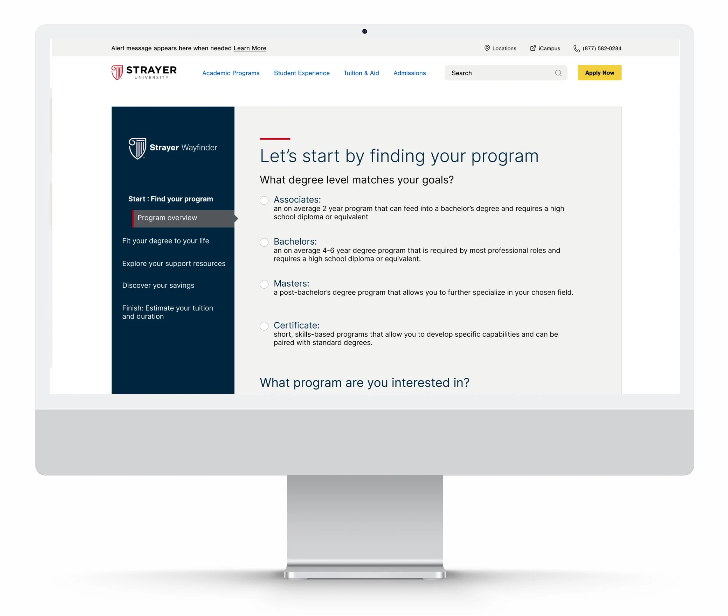
Strayer Wayfinder Tool
Codenamed "Voltron", the Wayfinder tool was meant to consolidate and package all the different web tools that is being used across Strayer.edu into one comprehensive experience for prospective students making their research into higher education.
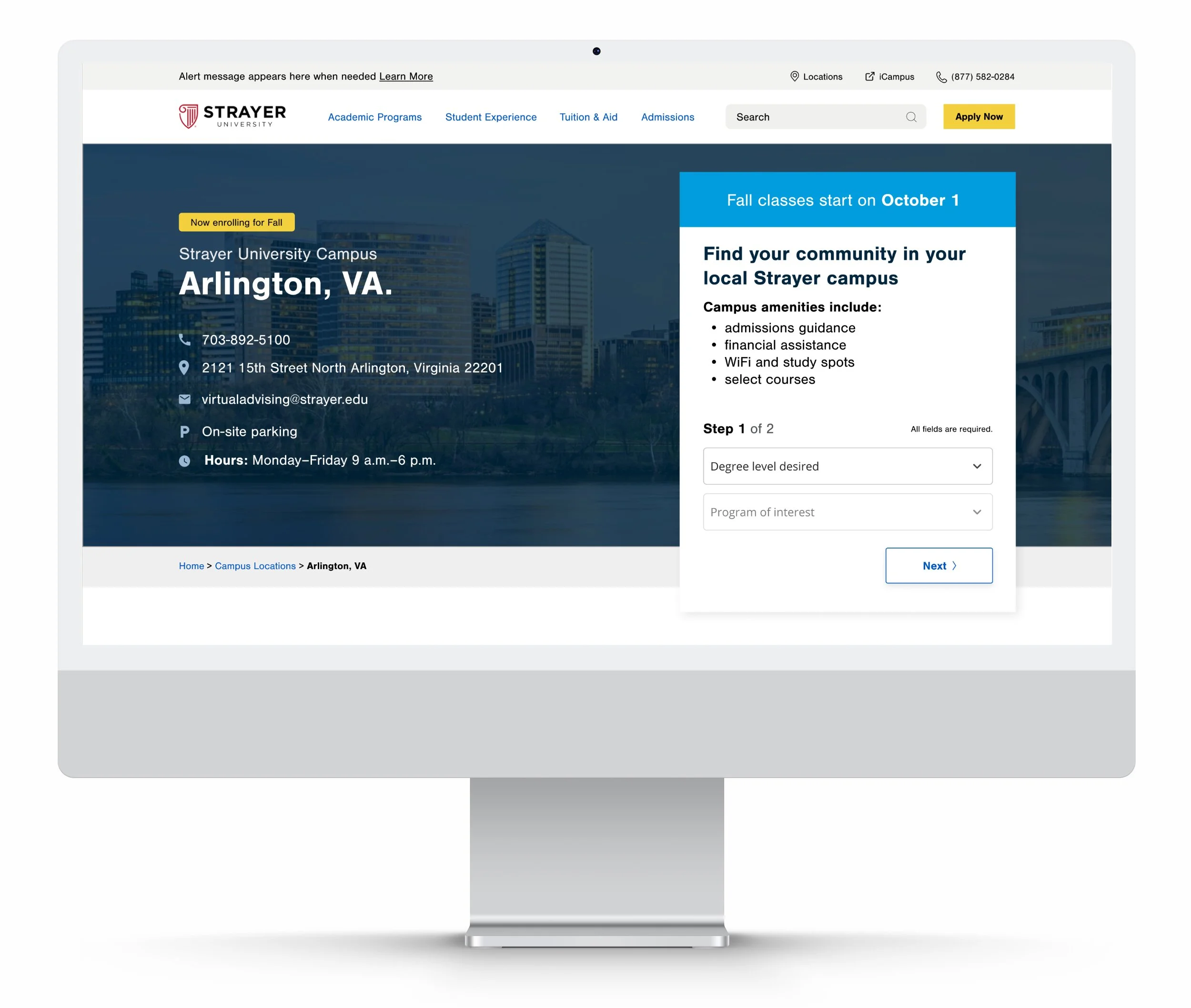
Strayer Campus Detail Pages
The Strayer University campus detail pages was in need of a redesign and it was a perfect opportunity not only to give it an aesthetic face lift, but also make sure that the information and overall experience of the page is as optimal and informational for the prospective students.
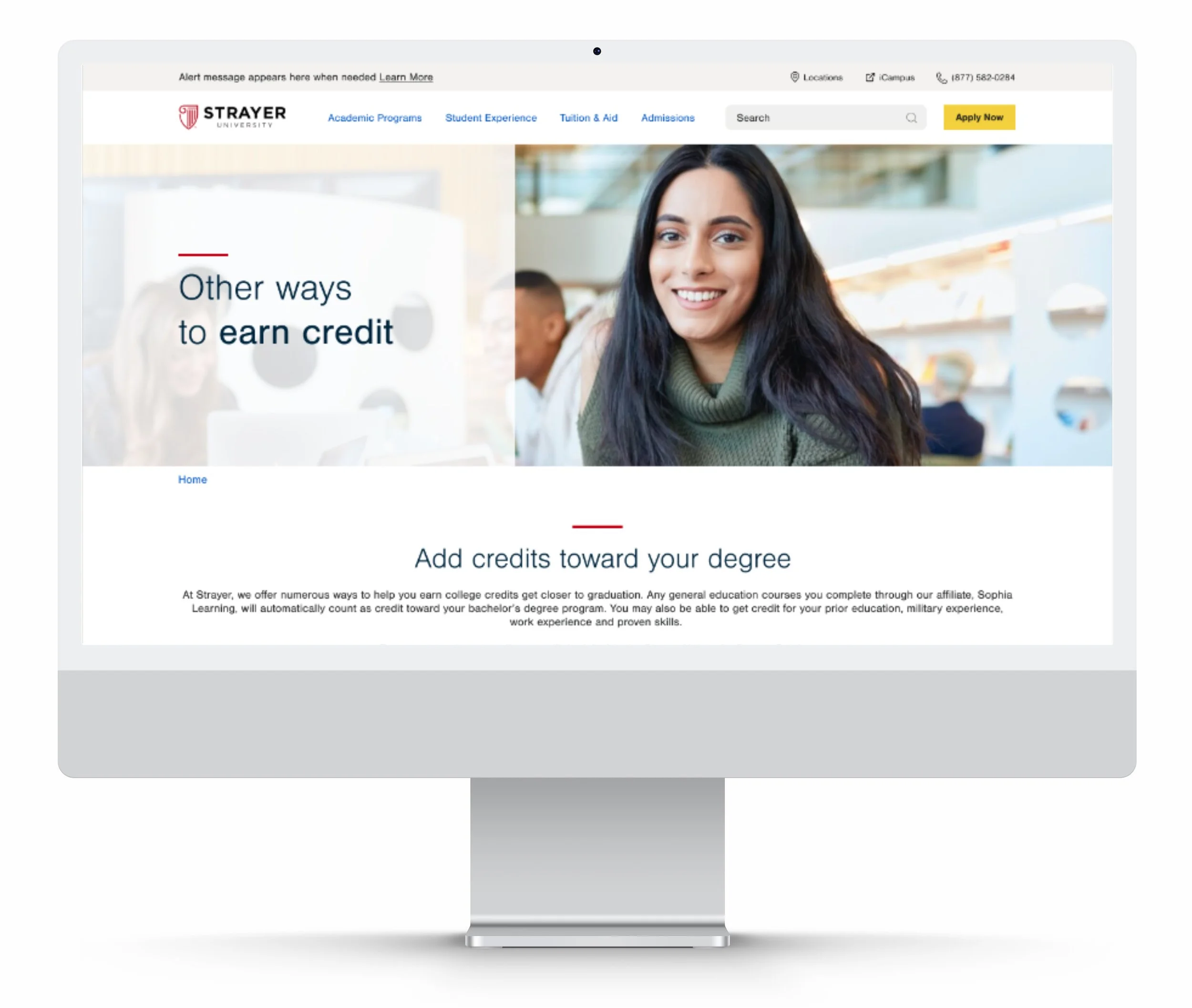
Strayer Other Ways to Earn Credit
Strayer University needed a page to let prospective students know of the different ways that they could earn credits that would count towards their degrees and get closer to graduation. The design of the page didn't need to be too complicated in order to communicate such valuable information. This is a perfect case of simpler is better at the end of the day.
Rosetta Stone Tablet Site
Back before Rosetta Stone had a responsive website, users' tablet device experience was less than optimal. Instead of leaving customers to wait for a full site redesign, a new tablet site was designed and developed as an intermediate step. This was done to both update to the brand aesthetics and test our hypotheses for an optimized tablet purchase experience.
My Account Interface Redesign
Rosetta Stone's learner account pages were outdated and full of usability pain points. It was brought to light when an increasing amount of call center inquiries were directly about current language learners wanting to modify, update or purchase more features for their accounts.
Rosetta Stone Enterprise Mobile Site
Rosetta Stone Enterprise was surprisingly late in the mobile game; not surprising as most of their business are conducted personally between their and the prospective companies' representatives. Nonetheless, the time came when they realized that customers are wanting to conduct their research, and that most of that initial phase take place using a mobile device.
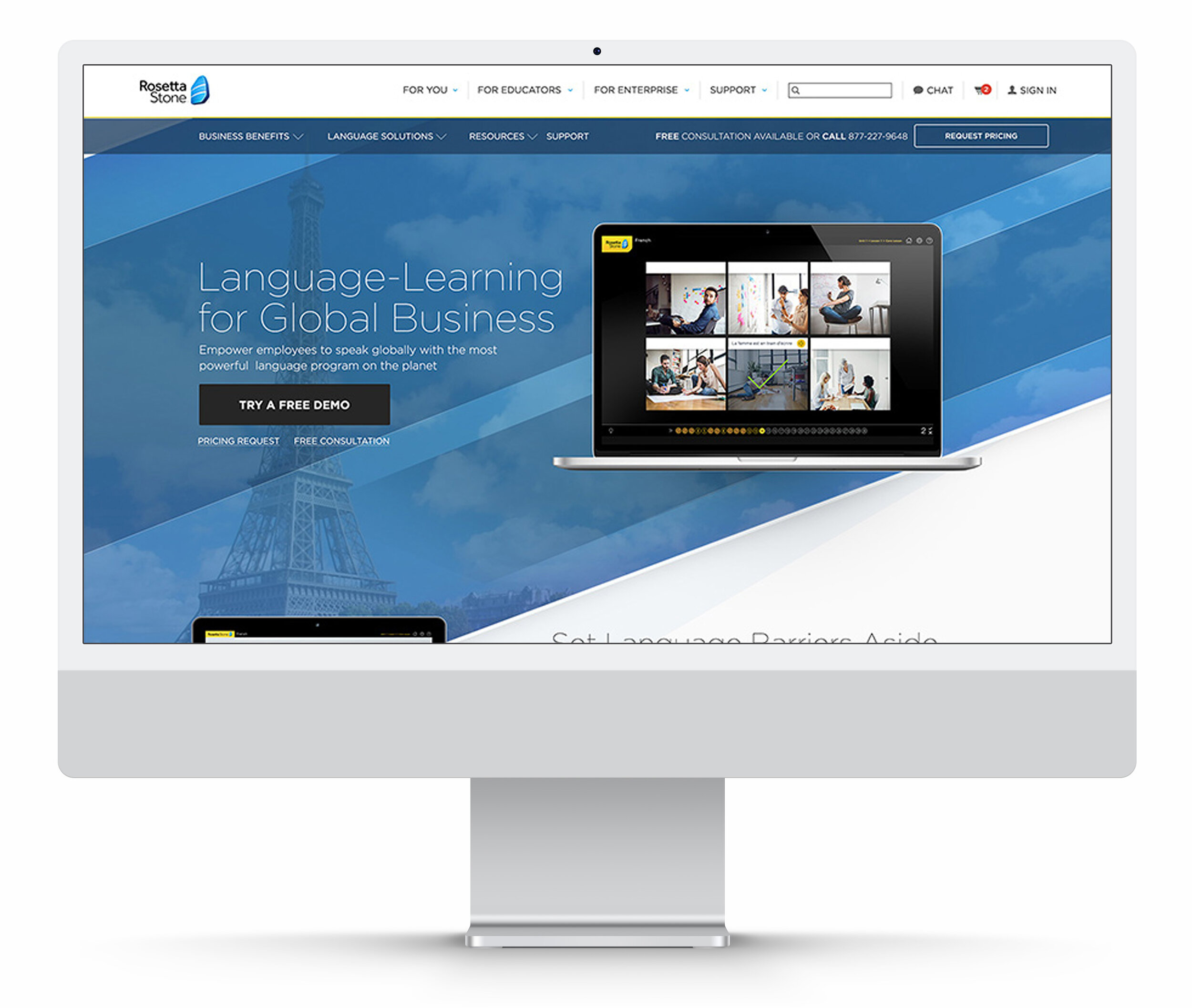
Rosetta Stone Enterprise and Education Pages
Rosetta Stone's Enterprise division had a very urgent need to update their customer facing pages asap. An entire site redesign will take too long, so while that is under way they needed new landing pages to serve to their prospective customers.
Rosetta Stone Competitor Comparison Page
A detailed comparison page between Rosetta Stone and its competitors in the industry of language learning.
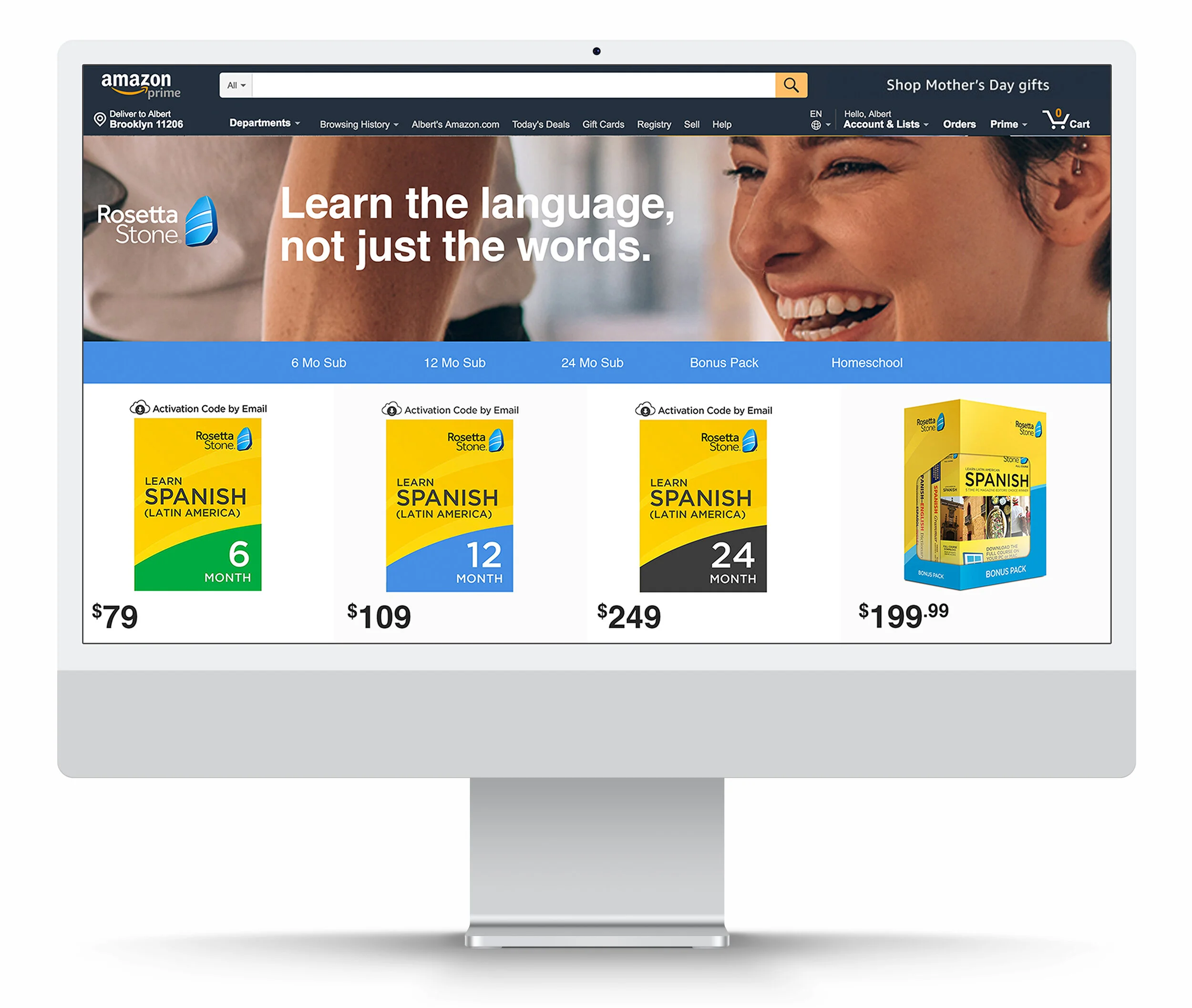
Rosetta Stone Amazon Brand Store
Design for the Rosetta Stone Brand store within the Amazon platform. A balance act of staying true to the brand within another platform.
Pocket Talk Landing Page
Partnership page between Rosetta Stone and Pocket Talk mobile device.


