Sophia Savings Visualizer Tool
Helping students save money on their pursuit to a higher education
Duration: 2 weeks / 1 Sprint Cycle
Role: Lead Product / UX Designer
Platform: Web
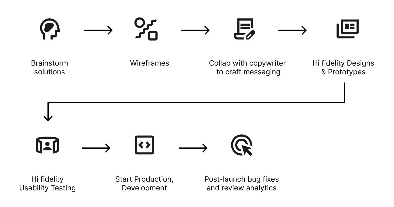
MY ROLE
As the senior ux designer I focused on making sure the tool not only delivered on the purpose and promise of the product, but it is executed in the way that abides by the best practices across different platforms a prospective student would use the tool.
After speaking with our UX Research team and Admissions Officers regarding the audience that we are aiming to serve, I knew that the tool had to be as no-nonsense and straightforward as much as possible while being upfront and accurate upon delivering the information that the are looking for.
THE PROBLEM - WHAT NEEDS TO BE SOLVED
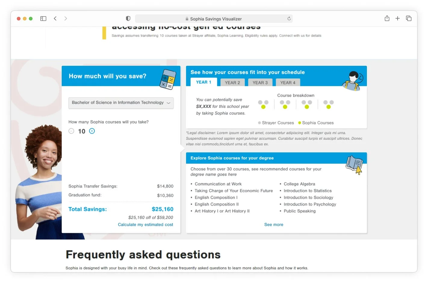
How do we communicate the accurate dollar amount that students could be saving?
How do we visually show the breakdown of a student's curriculum, year after year, and clearly illustrate how many free Sophia courses they could take?
Incorporate a way to give an accurate list of recommended courses they could take according to the program they want to pursue.
Allow a way to link to the Personalized Education Plan tool for more in-depth cost calculation.
Tool needs to be responsive and usable from desktop and down to mobile viewports.
CONSTRAINTS
The entire tool, and all of the copy, calculations and information that needs to be displayed needs to be within the bounds of the content width of SU.edu from desktop all the way down to mobile.
No Sophia branding elements can be utilized but instead be heavily Strayer University branded.
HOW DO WE DEFINE SUCCESS?
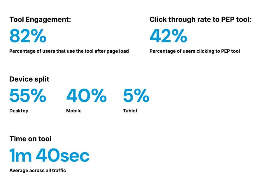
Lead more prospective students to use the more robust tool, the Strayer Personalized Education Program (PEP Tool). Research data suggests that individuals who interact with the PEP tool are 82% more likely to reach out to an admissions officer (A.O.)
Educate prospective students about different ways they could reduce their tuition so that they can discuss these opportunities with their respective admissions officers.
SOLUTIONS - TACKLING THE PROBLEM
Solution:
Simplify the initial UI so that it is straightforward and not be too overwhelming to suit our prospective Strayer students.
Impact:
Usability testing, and later analytics reporting revealed that not overcomplicating the UI design makes the tool engagement and completion to be encouraging.
Solution:
Break the content up into different well defined sections
Impact:
Allowed the most requested information be obvious (total savings) while also leading the user further into more relevant information regarding how Sophia courses work, how it is structured and the specific courses they are going to be able to take for their specific programs.

CHALLENGES - NOT EVERYTHING GOES AS PLANNED
Certain design and motion elements couldn’t be implemented that could have added more delight for the user’s experience.
FINAL RESULTS:
THE NUMBERS - ANALYTICS